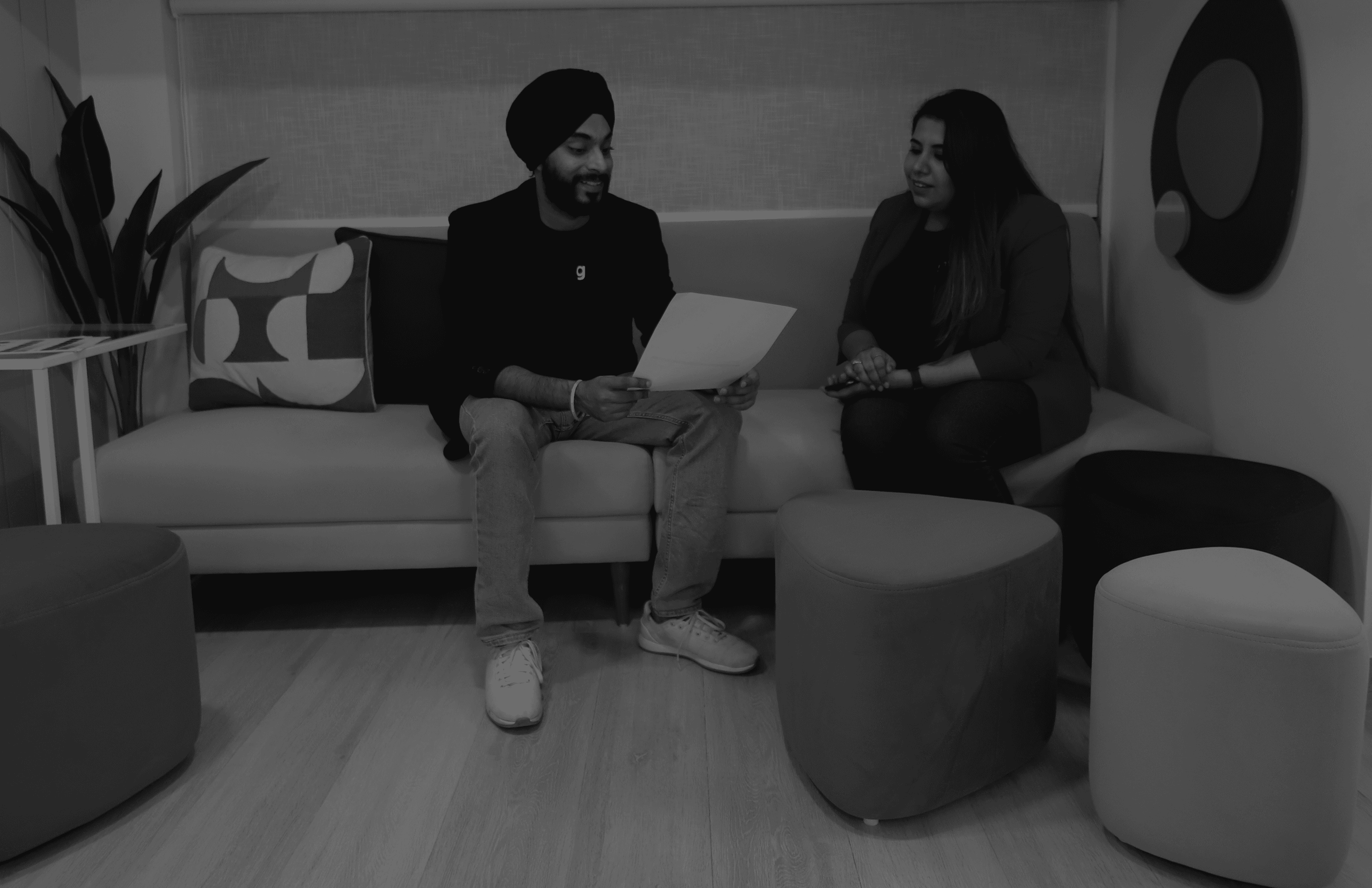
The Client
Policy Bazaar is like your one-stop insurance shop online. It helps you compare different insurance plans so you can pick the best one for you. Their website and app make it super easy to find the right coverage. They're all about making insurance simple and hassle-free for everyone in India.
Creative сhallenges
When they came to us, their current online platform for home insurance wasn't quite hitting the mark. Users were getting lost in the journey, and it wasn't turning into successful sign-ups as they hoped.
So, we set out to tweak things, making the user experience smoother and optimizing those conversations to bring in more customers.

Our Approach
We did a thorough analysis of their website and understood where the user drop offs were. Digging deep into the website data of a massive company like Policy Bazaar was no joke. Diving into their backend software and tracking their users’ actions was a bit of a struggle, but we managed to piece it all together in the end!
The Research
We looked closely at how users interacted with their platform, presenting our findings for their approval. Recognizing the importance of mobile users, we focused on designing for mobile devices first, as most of their visitors accessed the site from their phones.
The Research
We looked closely at how users interacted with their platform, presenting our findings for their approval. Recognizing the importance of mobile users, we focused on designing for mobile devices first, as most of their visitors accessed the site from their phones.

The Research
In the early phase of User Research we started by identifying who their target audience is and what can be the different use cases under which they would prefer the payment gateway. To gather this information we conducted interviews and segregated the data collected to emphasize on useful insights.
In the early phase of User Research we started by identifying who our Target Audience is and what can be the different use cases under which they would prefer the payment gateway. To gather this information we conducted interviews and segregated the data collected to emphasize on useful insights.
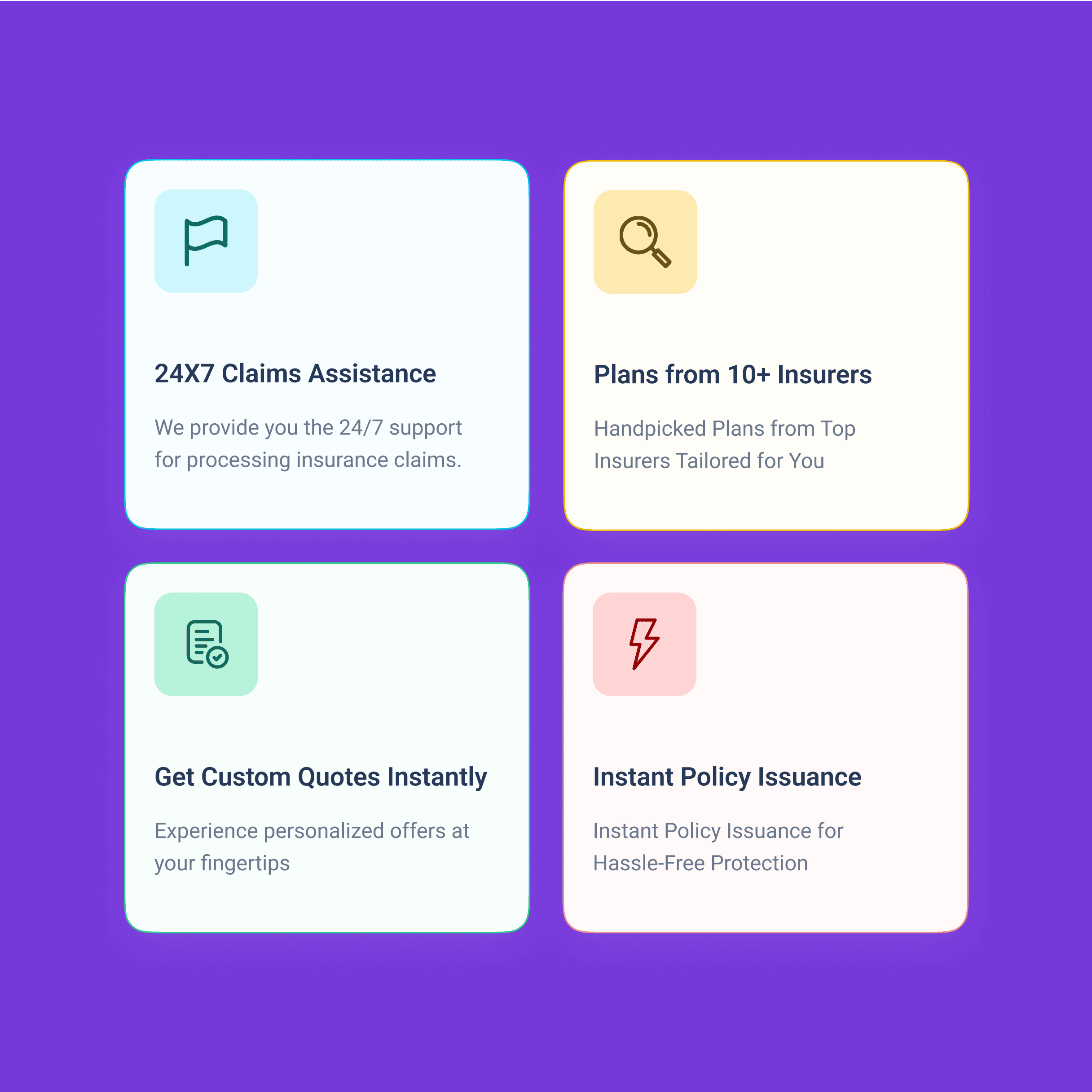

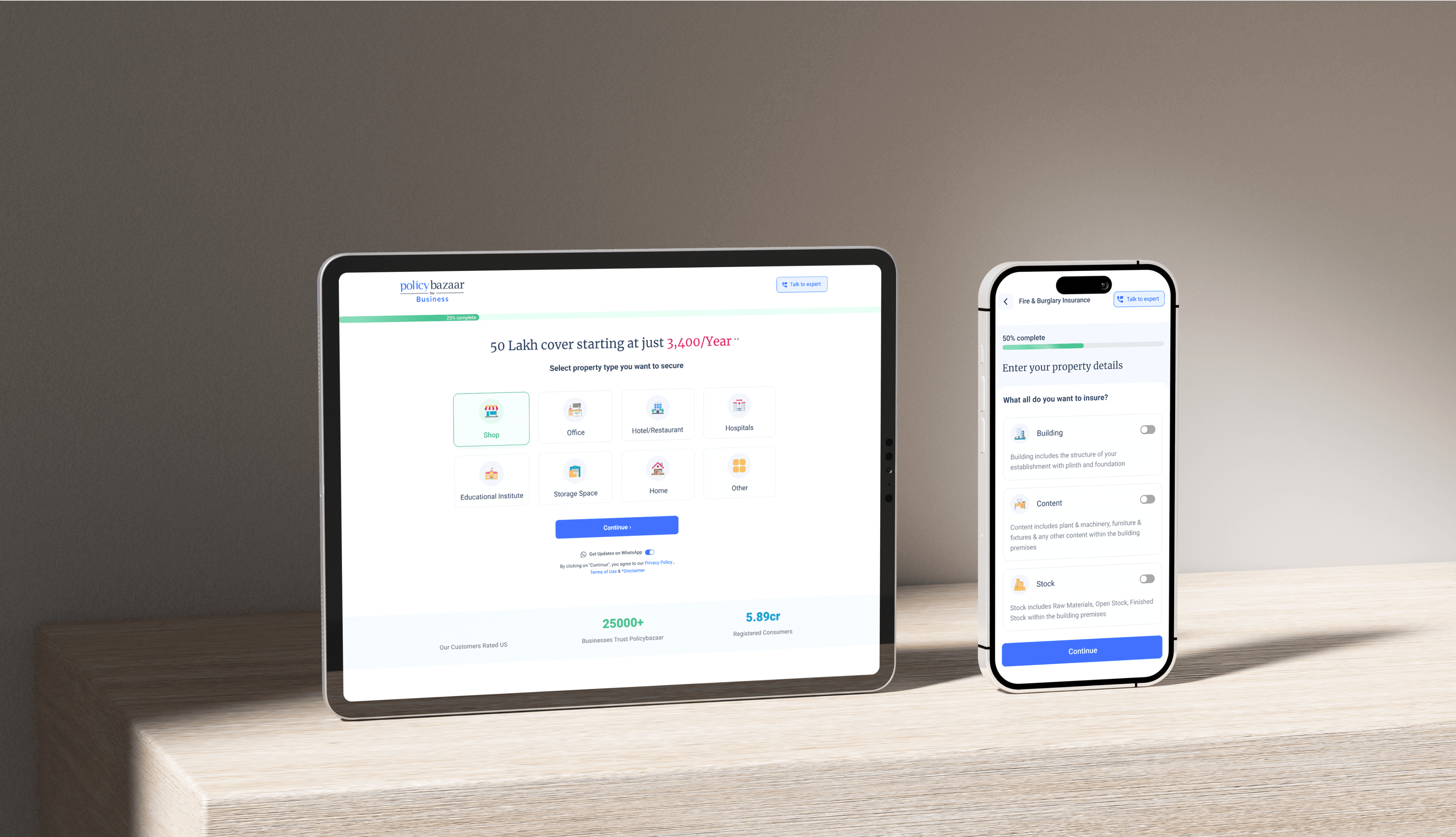
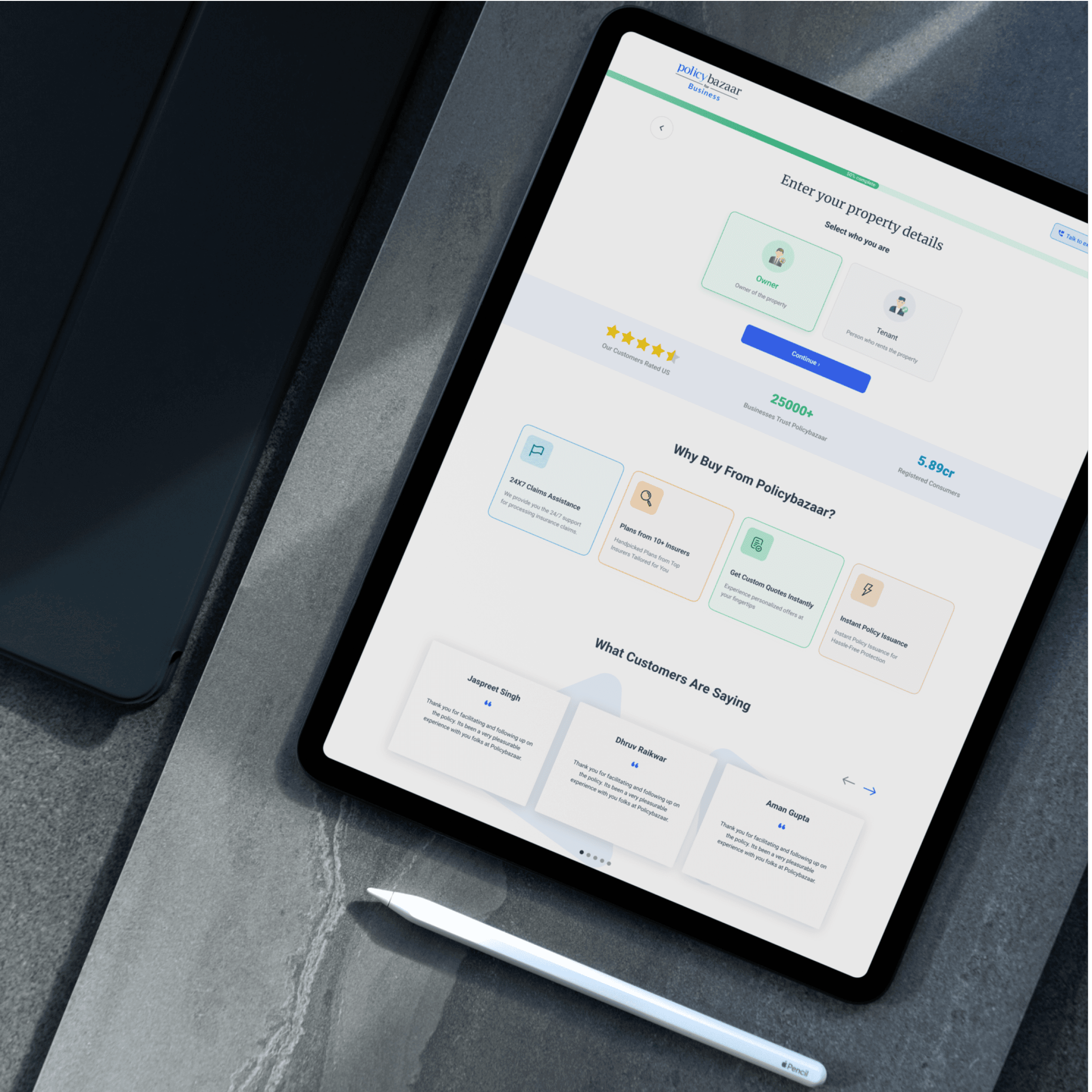
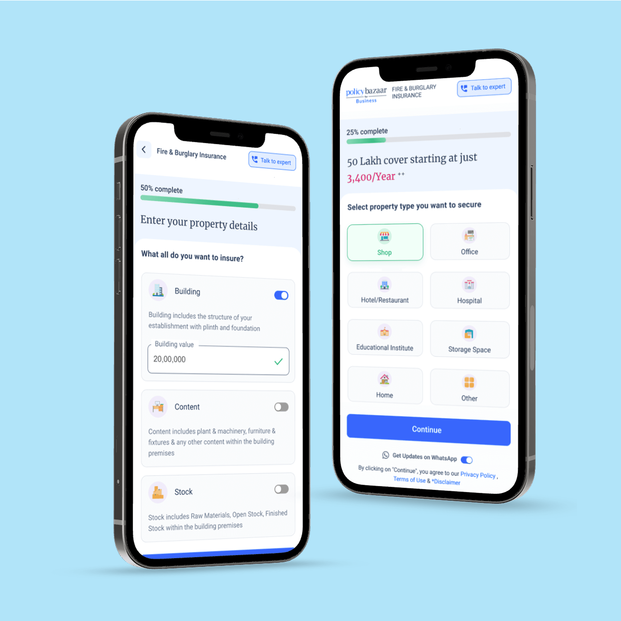
The Results
We noticed that their mobile experience wasn't up to par, so we built a better one from scratch, tested it extensively, and made tweaks based on user feedback. Once we were on the same page with the client, we expanded our design to include desktop users. We made sure every detail was just right.
After the mobile view, we seamlessly extended our design to cater to desktop users, ensuring a polished web view for all.

Next Case Studies
Artificial Intelligence
Web design
SaaS
Transforming UX & conversion for AI dubbing
Smarter UX, smoother dubbing, higher conversions.

Artificial Intelligence
Web design
SaaS
Transforming UX & conversion for AI dubbing
Smarter UX, smoother dubbing, higher conversions.
Ecommerce
Web design
_&Circus, but smoother
How we got &Circus in shape and gave their website the same confidence their customers feel
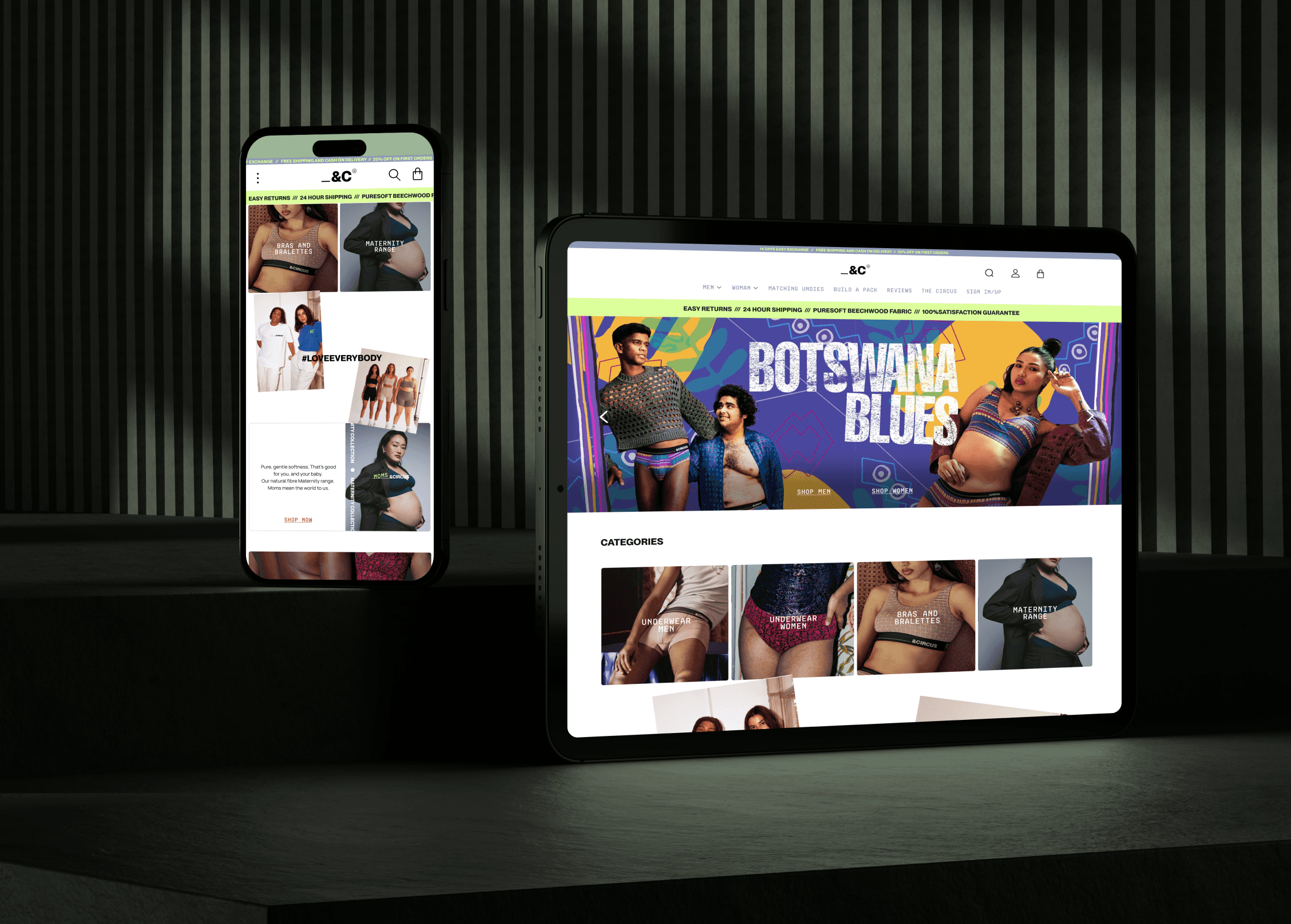
Ecommerce
Web design
_&Circus, but smoother
How we got &Circus in shape and gave their website the same confidence their customers feel